Showing posts with label illustrator. Show all posts

Wednesday, January 25, 2012

Hockey Vectors

Hope Cup Hockey - Broomball Edition Second Iteration

I have quite a few hand drawn hockey related vectors - sticks, pucks, balls, etc - that I made for this project, let me know if I should post them!


Check out more on this project - also I don't really post on this blog anymore...as you can see. If you would like to post here or take over...let me know.

Read More......

Tuesday, April 20, 2010

Day 115

Read More......

Monday, April 19, 2010

Day 114

Read More......

Sunday, March 28, 2010

Day 113

Read More......

Friday, March 26, 2010

Day 112

Read More......

Thursday, March 25, 2010

Day 111


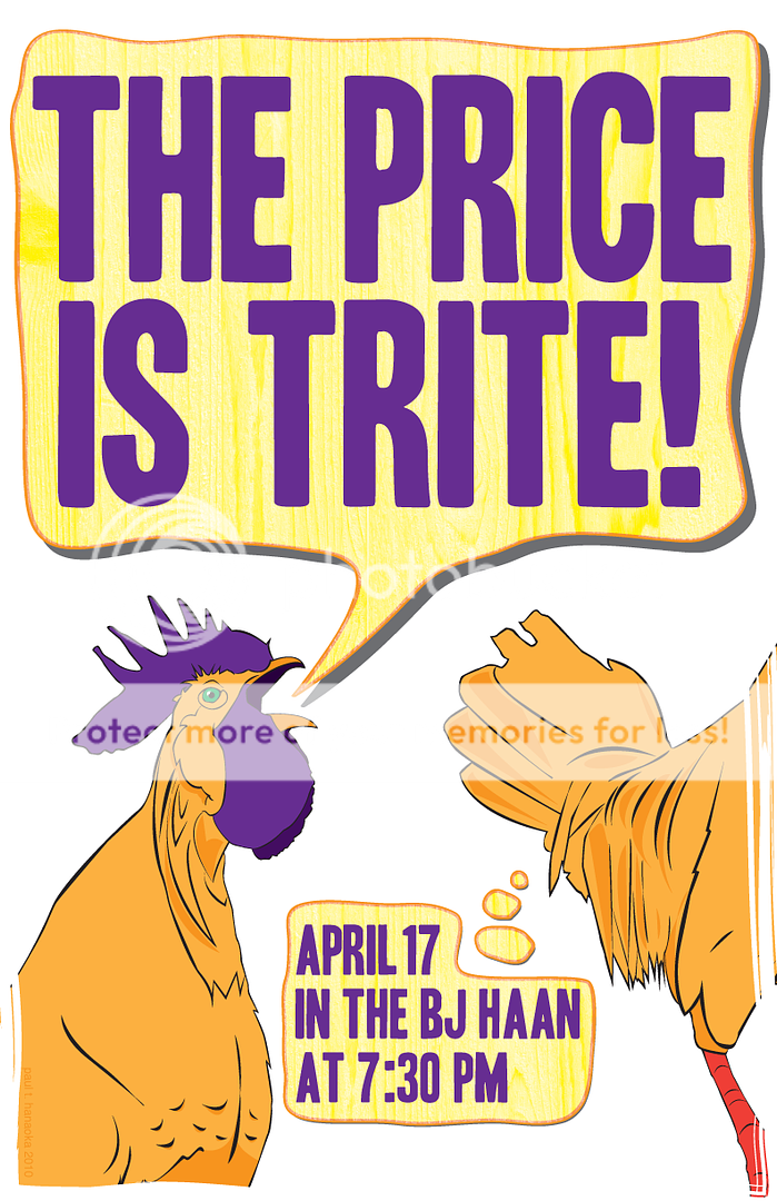
a quick poster I made for ...well you can just read the poster. 2 more colors after the jump...


Read More......

Saturday, February 20, 2010

Day 110


After 2 previous attempts to hold this event, it is [allegedly] finally going to take place this Tuesday. Oddly enough the image of our president that I had used for the first two posters became unfit for print for this third version, and with literally 10 minutes to revise this poster I came up with the universal sign for the handicapped - upon reflection I realize that my train of thought didn't make a lot of sense, but it sounded logical at the time...

Read More......

Friday, February 12, 2010

Day 109

Read More......

Tuesday, February 9, 2010

Day 104

Read More......

Monday, January 25, 2010

Day 101

Read More......

Thursday, November 12, 2009

Day 97


A (rejected) poster...

Read More......

Sunday, November 1, 2009

Day 96

Read More......

Saturday, October 31, 2009

Day 95

Read More......

Tuesday, June 2, 2009

Day 25

Read More......

Monday, June 1, 2009

Day 24

Read More......

Saturday, May 30, 2009

Day 22

Read More......

Sunday, May 24, 2009

Day 16


A new store -

Read More......

Saturday, May 23, 2009

Day 15


This took about 4 hours, including research...which variation is preferred? The paper background was an afterthought, I think it relates well to the old, illustrative aspect of the design and provides a good contrast to the modern, sans serif typeface. However it does muddy the design a little bit, especially in the color variation. I prefer the black/paper & the color/white combination's.

Read More......

Friday, May 22, 2009

Day 14

i hate how i have not figured out how to be more precise in photoshop.

Read More......

Sunday, May 17, 2009

Day 9

it is Sunday...and I didn't have internet access all day - plus I listened to this. Plus there was a earthquake here tonight. Excuses!

Read More......